NodeGUI is an open source library for building cross-platform, native desktop applications with JavaScript and CSS-like styling.
In this article, I’m going to demonstrate how to get up and running with NodeGUI. We’ll set up a development environment, take a look at several of the library’s basic concepts, then finish off by creating a simple password generator app.
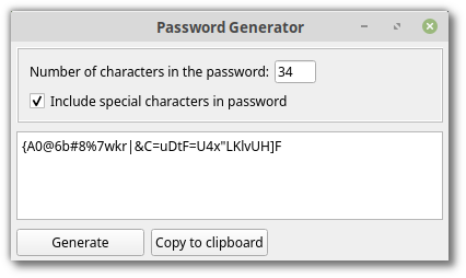
If you’re curious as to what we’ll end up with, the finished code can be found on GitHub.
And this is what the app will look like:
Why Not Electron?
Before we get into it, let’s look at why you might want to use NodeGUI, as opposed to one of the more popular Chromium-based solutions, such as Electron.
Electron Apps are Bloated
The main criticism levelled at Electron apps, is that they are bloated and require too much memory. This is because each Electron app ships with a version of the Chromium browser and is not in a position to share resources, as native apps would.
For larger apps on a high-powered machine, this is fine. But when it comes to anything I’m likely to write, shipping a whole browser to render my app feels rather like cheating.
NodeGUI on the other hand, is powered by the Qt framework. This means that its widgets are rendered natively and that it does not need to open up a browser instance to render the UI. This makes it CPU/memory efficient and much more suited to my needs.
Privacy Concerns
As mentioned, Electron apps are based on the open-source version of Google Chrome and, privacy-wise, this is not ideal. Google has become unbelievably data hungry in the past few years, and in my opinion Chromium cannot be trusted to not phone home in some way shape or form.
With NodeGUI, this is obviously a non-issue.
Why Not NodeGUI?
Although NodeGUI is under active development, the project is in its infancy and the maintainer currently advises against using it in production.
You should also be aware that only a subset of Qt’s modules have been implemented so far. This means that you might find yourself in need of a widget that has yet to be ported. What to do in this case is addressed in the Getting Help and Contributing section of this article.
And there are a couple of issues when it comes to building/distributing the app. These too, are covered at the end of the article.
In short, if you’re looking for a polished, turn-key solution, you’re probably better off going with Electron at this time.
Setting Up a Dev Environment
With that out of the way, let’s get NodeGUI up and running.
Node.js
NodeGUI requires Node version 12.x or above, so let’s get that installed first.
Either head on over to the project’s home page and download the correct binaries for your system, or use a version manager such as nvm. I would recommend using a version manager where possible, as this will allow you to install different Node versions and switch between them at will. It will also negate a bunch of potential permissions errors.
You can check that the installation process went well by typing node -v to confirm the version you are running.
Additional Dependencies
I’m running Linux, so the installation instructions in this section will reflect that. For other operating systems, please check the documentation.
To get NodeGUI working, we’ll need to install Make, GCC v7 and CMake. This can be done with:
sudo apt-get install make gcc cmake
On a standard Linux install the chances are that Make and GCC will be installed already. Once done, you can check the versions using:
make -v
$ GNU Make 4.1

gcc -v
$ gcc version 7.4.0 (Ubuntu 7.4.0-1ubuntu1~18.04.1)

cmake --version
$ cmake version 3.10.2
Finally, it is advisable (but probably not essential) to install the pkg-config and build-essential packages. You can do this using:
sudo apt-get install pkg-config build-essential
And that’s it, we’re good to go.
Clone the Starter Repo
Next, let’s clone the nodegui-starter repo. This will provide us with the minimal setup we need to start developing.
git clone https://github.com/nodegui/nodegui-starter
cd nodegui-starter
npm install
Running npm install will download a custom Node binary called Qode, upon which NodeGUI is based. It will then use the tools we installed previously to compile the C++ files that comprise the library.
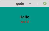
After this has completed, you can run npm run start from the project root, to see the canonical “Hello, World!” example. Under the hood, this command will kick off webpack, which transpiles the contents of src/index.ts to dist/index.js which is then served up using Qode.
And here’s the result. Pretty, no?
Examining the Demo App
Before moving on to building something ourselves, let’s have a look at the demo app to highlight a couple of NodeGUI concepts.
Open src/index.ts in your editor of choice — as it’s a TypeScript file, you might want to install syntax highlighting if you haven’t already. For Sublime Text, I use the TypeScriptSyntax package.
Don’t worry if you haven’t any experience with TypeScript. Although NodeGUI offers first class TypeScript support, it also works just fine with regular JavaScript. The password generator that we will build later on will be written in JavaScript, not TypeScript.
Import the Widgets You Need
The first few lines of index.ts look like this:
const {
  QMainWindow,
  QWidget,
  QLabel,
  FlexLayout
} = require("@nodegui/nodegui");
All this does is import the necessary modules for the GUI.
You can find a list of all available modules in the project’s excellent documentation. This list is steadily growing and if you ever find yourself in need of modules or functionality which hasn’t yet been implemented, you can open an issue in the NodeGUI repo to ask if/when it might be added.
Creating a Window and Adding a Layout
The following lines create a main application window and display it. Every widget in NodeGUI should be a child, or nested child of QMainWindow.
const win = new QMainWindow();
...
win.show();
(global as any).win = win;
The final line is the only bit of TypeScript in the file. It compiles to global.win = win; in JavaScript. The purpose of this line is to prevent the garbage collection of win, which would otherwise see the window disappear after a few minutes.
Before any widgets can be added to the main application window, it needs to have a central widget set. This is a QWidget which can be used to encapsulate other widgets and provide structure. It has a similar role to that of a div in the web world.
const centralWidget = new QWidget();
...
win.setCentralWidget(centralWidget);
One of my favourite features of NodeGUI is that it has full support for flexbox layout. To add this to the main application window, the FlexLayout module is used.
const rootLayout = new FlexLayout();
centralWidget.setLayout(rootLayout);
If you’re unfamiliar with flexbox, check out this friendly introduction over on SitePoint to get up to speed quickly.
Adding Child Widgets and Styling
The demo app uses two child widgets to display a greeting. The first of these looks like so:
const label = new QLabel();
...
label.setText("Hello");
...
rootLayout.addWidget(label);
Nothing too exciting happening here. A QLabel widget is created and the text “Hello” is added to it. So that the widget will display in the app, it must be added to the FlexLayout mentioned above.
The second widget is slightly more interesting. It’s mostly the same as the first, but the setInlineStyle method is used to apply some styling.
const label2 = new QLabel();
label2.setText("World");
label2.setInlineStyle(`
  color: red;
`);
...
rootLayout.addWidget(label2);
The setStyleSheet method can also be used to style widgets. For this to work, the widgets need to be assigned an object name using the setObjectName method. Object names are similar to IDs in the web world and allow widgets to be targeted with style rules.
centralWidget.setObjectName("myroot");
...
label.setObjectName("mylabel");
...
win.setStyleSheet(
  `
    #myroot {
      background-color: #009688;
      height: '100%';
      align-items: 'center';
      justify-content: 'center';
    }
    #mylabel {
      font-size: 16px;
      font-weight: bold;
    }
  `
);
As you can see, the items in the central widget are being aligned using the align-items and justify-content properties.
And that’s the demo app. Take a while to make sure you understand the code before moving on to the next section.
Building a Password Generator
Now that we’re familiar with some NodeGUI concepts, let’s turn our hand to building something more interesting, namely a password generator. This app should allow a user to enter a password length, then generate a random password of said length. The user should also be able to specify if the password should contain special characters or not.
In the following sections we’ll create this app step by step, however please be aware that you can grab the completed code from the accompanying GitHub repo.
Create an App Skeleton
As mentioned above, I’ll be using JavaScript and not TypeScript to create the app. Consequently rename src/index.ts to src/index.js and ensure it contains the following code:
const {
  QMainWindow,
  QWidget,
} = require('@nodegui/nodegui');

const win = new QMainWindow();
win.setWindowTitle('Password Generator');
win.resize(400, 200);

// Root view
const rootView = new QWidget();

win.setCentralWidget(rootView);
win.show();

global.win = win;
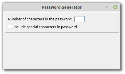
There shouldn’t be anything surprising here. We are creating a main application window and setting its title and size. We are then creating a root view and setting it to be our central widget, so that we can add child widgets in the next step.
If you run npm run start in the root directory, this is what you should see.

Designing an App Layout
Next we need to consider how the app will be structured. To make things easier to visualize, I’ve created a diagram depicting the layout.
The widgets are numbered 1-10. They specify the widget type, as well as the variable name by which they will be referenced.
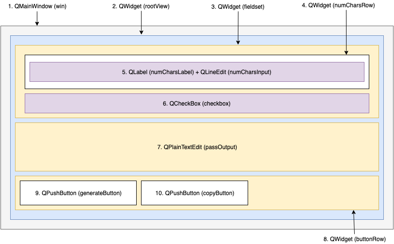
This breaks down as follows:
- Main application window
- Main window’s central widget
- Container for password options
- Container for first row of password options
- Label and text input to enter desired password length
- Checkbox to specify if special characters should be used
- Text area to display generated password
- Container for buttons
- Button to generate a password
- Button to copy the generated password to the clipboard
Now let’s translate that to code. We’ll start off with password options.
Note:
...denotes code mentioned in previous sections, which I don’t intend to repeat every time. If you would like to compare with the finished file, please check here.
const {
  ...
  FlexLayout,
  QCheckBox,
  QLabel,
  QLineEdit,
} = require('@nodegui/nodegui');

...

// Root view
...
const rootViewLayout = new FlexLayout();
rootView.setObjectName('rootView');
rootView.setLayout(rootViewLayout);

// Fieldset
const fieldset = new QWidget();
const fieldsetLayout = new FlexLayout();
fieldset.setObjectName('fieldset');
fieldset.setLayout(fieldsetLayout);

// Number characters row
const numCharsRow = new QWidget();
const numCharsRowLayout = new FlexLayout();
numCharsRow.setObjectName('numCharsRow');
numCharsRow.setLayout(numCharsRowLayout);

const numCharsLabel = new QLabel();
numCharsLabel.setText('Number of characters in the password:');
numCharsRowLayout.addWidget(numCharsLabel);

const numCharsInput = new QLineEdit();
numCharsInput.setObjectName('numCharsInput');
numCharsRowLayout.addWidget(numCharsInput);

const checkbox = new QCheckBox();
checkbox.setText('Include special characters in password');

// Add the widgets to the respective layouts
fieldsetLayout.addWidget(numCharsRow);
fieldsetLayout.addWidget(checkbox);
rootViewLayout.addWidget(fieldset);

// Styling
const rootStyleSheet = `
  #rootView {
    padding: 5px;
  }
  #fieldset {
    padding: 10px;
    border: 2px ridge #bdbdbd;
    margin-bottom: 4px;
  }
  #numCharsRow, #buttonRow {
    flex-direction: row;
  }
  #numCharsRow {
    margin-bottom: 5px;
  }
  #numCharsInput {
    width: 40px;
    margin-left: 2px;
  }
`;

rootView.setStyleSheet(rootStyleSheet);

...
The main thing to notice here is that for each QWidget (which, remember, is like a div element in web terms), we create a new FlexLayout. This allows us to lay out the QWidget’s child widgets using flexbox.
Notice also how we use the addWidget method to add the widgets to their respective layouts.
If at this point you run the app using npm run start, you should see:
Next, let’s add the widget to display the generated password. We’ll use a QPlainTextEdit widget for the purpose. Let’s start by requiring it:
const {
  ...
  QPlainTextEdit,
} = require('@nodegui/nodegui');
Next, create the layout:
// Generated password output
const passOutput = new QPlainTextEdit();
passOutput.setObjectName('passOutput');
passOutput.setReadOnly(true);
passOutput.setWordWrapMode(3);
Notice that we make it read only and that we set its word wrap mode to 3. This will prevent the widget attempting to insert line breaks into the password when it contains special characters.
Finally, add the widget to the root view layout and add some styling.
// Add the widgets to the respective layouts
...
rootViewLayout.addWidget(passOutput);

// Styling
const rootStyleSheet = `
  ...
  #passOutput {
    height: 85px;
    margin-bottom: 4px;
  }
`;
Now when you run the app, you should see this:

Finally, let’s add the buttons to generate the password and copy it to the clipboard. For this we’ll use the QPushButton widget.
const {
  ...
  QPushButton,
} = require('@nodegui/nodegui');

...

// Button row
const buttonRow = new QWidget();
const buttonRowLayout = new FlexLayout();
buttonRow.setLayout(buttonRowLayout);
buttonRow.setObjectName('buttonRow');

// Buttons
const generateButton = new QPushButton();
generateButton.setText('Generate');
generateButton.setObjectName('generateButton');

const copyButton = new QPushButton();
copyButton.setText('Copy to clipboard');

// Add the widgets to the respective layouts
...
buttonRowLayout.addWidget(generateButton);
buttonRowLayout.addWidget(copyButton);
rootViewLayout.addWidget(buttonRow);

// Styling
const rootStyleSheet = `
  ...
  #buttonRow{
    margin-bottom: 5px;
  }
  #generateButton {
    width: 120px;
    margin-right: 3px;
  }
  #copyButton {
    width: 120px;
  }
`;
This process should be familiar by now: require the widget, create a layout, add the widget to the layout, then add some styling.
Now when you run the app, it should look like this:

If you’re seeing anything different, check index.js on GitHub to find out where you have gone wrong.
Adding Functionality to the App
Now we have our layout done, it’s time to make the app do something. Let’s start off by attaching an event listener to the Generate button, which will log whatever value the user has entered.
To make the buttons do anything, we’re going to need the QPushButtonEvents module.
const {
  ...
  QPushButtonEvents,
} = require('@nodegui/nodegui');

// Event handling
generateButton.addEventListener(QPushButtonEvents.clicked, () => {
  const passwordLength = numCharsInput.text();
  const includeSpecialChars = checkbox.isChecked();

  passOutput.setPlainText(`
    You entered: ${passwordLength}
    Special characters: ${includeSpecialChars? 'yes' : 'no'}
  `);
});
As you can see, we can access the value of the QLineEdit using its text method and the value of the QCheckbox with its isChecked method. We can also use the QPlainTextEdit’s setPlainText method to set this widget’s value.
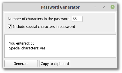
Now when you run the app, enter something and press Generate, you should see the values you enter logged to the password field.
Generating Passwords
Finally we come to generating passwords, which is after all, the purpose of the app.
The way this will work is that we will declare thee arrays representing the character sets, a-z, A-Z and 0-9. We will also declare a fourth array combining all of these with any special characters.
To keep the code nice and concise, I’m going to make use of a couple of lodash methods.
Let’s start by installing that:
npm install lodash
Then, to declare our character sets:
const _ = require('lodash');

...

const NUMBERS = _.range(0, 10).map(num => num.toString());
const ALPHABET_LOWER = _.range(97, 123)
                        .map(chr => String.fromCharCode(chr));
const ALPHABET_UPPER = _.range(65, 91)
                        .map(chr => String.fromCharCode(chr));
const ALL_POSSIBLE_CHARS = _.range(33, 127)
                            .map(chr => String.fromCharCode(chr));
Here, we’re making use of lodash’s range method, which creates an array of numbers from start up to, but not including, end. For everything other than our first array (0-9), we’re then mapping over these numbers to generate a second array of characters using the ASCII Character Set.
Next, we need to add a fifth array, containing two further arrays — one with all of the number and letter characters, and one containing every conceivable character we are going to use. Which one of these arrays is employed, depends upon whether the user has checked the Use special characters checkbox or not.
const CHARSETS = [
  ALL_POSSIBLE_CHARS,
  [...NUMBERS, ...ALPHABET_LOWER, ...ALPHABET_UPPER]
];
If you want to check for yourself what these arrays contain, just try logging them to the console and restarting the app.
Adding the Event Handler
Now, let’s declare two functions: one to grab the relevant character set and one to generate the password
// Logic
function getCharSet(includeSpecialCharacters) {
  return includeSpecialCharacters? CHARSETS[0] : CHARSETS[1];
}

function generatePassword(passwordLength, charSet) {
  return _.range(passwordLength).map(() => _.sample(charSet)).join('');
}
And hook up the event listener to take advantage of them:
// Event handling
generateButton.addEventListener(QPushButtonEvents.clicked, () => {
  const passwordLength = numCharsInput.text();
  const includeSpecialChars = checkbox.isChecked();
  const charSet = getCharSet(includeSpecialChars);

  passOutput.setPlainText(
    generatePassword(passwordLength, charSet)
  );
});
As you can see, when the user clicks the Generate button, we determine the password length, whether special characters are required, and which character set to use.
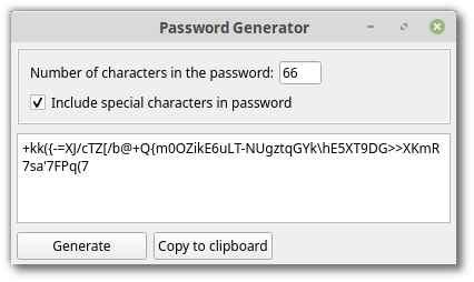
Then we call the generatePassword function which creates an array of numbers corresponding to the desired password length. It then maps over this array and uses lodash’s sample method to grab random characters from whatever character set it was passed. It then calls join() on this array to turn it into a string, which it returns.
Finally, this return value is set as the value of the QPlainText widget.
At this point we have a functioning password generator.
Adding Copy to Clipboard
To round things off, let’s implement the copy to clipboard functionality. This can be done in a couple of lines of code using the QApplication module, which manages the application’s control flow and main settings.
const {
  QApplication,
  ...
} = require('@nodegui/nodegui');

// Clipboard
const clipboard = QApplication.clipboard();

// Event handling
...

copyButton.addEventListener(QPushButtonEvents.clicked, () => {
  clipboard.setText(passOutput.toPlainText(), 0);
});
Here QApplication.clipboard() returns an object for interacting with the clipboard. We can use this object’s setText method to alter the actual clipboard’s contents.
Run the app and give it a try to satisfy yourself that it works.
Distribution
Before calling it a day, let’s look at how to package and distribute our app. To do this, we’ll need to install an extra dependency called Packer.
npm install --save-dev @nodegui/packer
Once it has downloaded and installed you need to run the init command from the project root.
npx nodegui-packer --init PasswordGenerator
This will create a deploy directory containing a template. You can modify this template to suit your needs, for example by adding icons, changing the name/description, or adding other native features.
Finally run the pack command.
npx nodegui-packer --pack dist
This command creates a build directory inside of the deploy directory containing a platform-specific standalone executable.
I thought You Said Cross-platform?!
Yeah, sorry, I did.
NodeGUI is a young project and unfortunately cross-platform support is not quite there yet. That is to say, if you need cross-platform builds, you have to run the packer in each of the different OS environments.
Also, while we’re at it, I called Electron bloated at the top of the article. However, examining the AppImage file produced on Linux, one sees that it’s 45MB in size! That’s not exactly slimline…
Both of these points are on the Packer roadmap to be addressed in a future release. Nonetheless they bear mentioning here.
Getting Help and Contributing
While building the password generator app, there were a couple of times that I ran up against problems. For example, I was unsure how to get a QCheckBox’s checked state, so I opened an issue on the project’s homepage. As you can see, I got an answer a short while later from the project maintainer, who is both very friendly and very helpful.
If you run into any issues while using NodeGUI, the issues section is a good place to ask for help.
Contributing
The NodeGUI project is actively looking for contributors and there are several ways you can help. You can find the contributor’s guide here.
If you have a basic C++ knowledge, you can help by adding unexported methods to existing widgets — this issue and this PR can be used as a guide
You can also help by addressing bugs, or contributing to the documentation. Hacktoberfest starts soon and it’d be awesome to see this project get some love.
Conclusion
In this article I have demonstrated how to get up and running with NodeGUI. I introduced you to several of the library’s basic concepts and have shown how to build and package a simple app.
As a next step, I would encourage you to build something cool of your own.
And please contribute back to the project if you can. It would be amazing if NodeGUI gained some traction.
Comments